We Built Google Maps for Kubernetes video
This video is hosted by YouTube. Loading it allows YouTube to process connection and device data.

The first time you look at a map of Europe, you don't need a legend to know Italy is the boot-shaped one. You don't read a label, you don't search anything, you just recognize the shape and you're oriented. That's the entire pitch behind CloudMaps, our take on visualizing a Kubernetes cluster inside K8Studio, and it's worth being precise about why it works, because "maps are nice" isn't an argument, it's a feeling. The argument is that a map does four specific things a list or a tree never will, and once you name those four things, you can build a piece of software around each one deliberately instead of just making a dashboard prettier.
Before getting into the four, it's worth a minute on why we reached for this at all. Around 6600 BC, someone in a settlement called Çatalhöyük painted a nine-foot map of the town on a wall, buildings laid out exactly as they stood, a volcano erupting on the horizon behind it. Nobody taught them what a map was for. In 1971, John O'Keefe found the reason why: neurons in the hippocampus, "place cells," that fire only when you're in a specific location, building a literal internal map of your surroundings. In 2005, May-Britt and Edvard Moser found the other half, "grid cells," laying down the coordinate system place cells plot onto. The three of them shared the 2014 Nobel Prize in Physiology or Medicine for describing what the committee called the brain's own positioning system. That system is dedicated hardware, evolved over millions of years, for exactly one job: understanding space. Nobody has dedicated hardware for parsing nested YAML. So when a namespace list in kubectl feels exhausting after the tenth cluster of the week, that's not a skill issue. It's a hardware mismatch. We built the primary interface for understanding infrastructure around the one representation our brains are worst at holding onto, when we already had, sitting unused, the one representation they're best at.
Here's what that representation actually does, concretely, and how each of those four properties shows up in CloudMaps specifically, not as a coat of paint over the same underlying resource list, but as the actual thing the software is built around from the ground up.
1. A map aggregates, without throwing anything away
A map of Europe doesn't show you every building. It shows you countries, then cities, then streets, only once you ask for that level of detail by zooming in. Nothing is deleted, it's just not drawn until you need it. That's a completely different operation than filtering a list, which discards items you didn't ask for. Aggregation keeps everything reachable while showing you only what's relevant at your current scale.
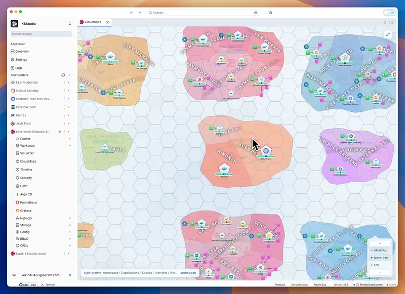
This is the actual mechanism CloudMaps is built around, not a visual theme laid on top of the same old resource list. Pods aggregate into the workload that owns them. Workloads and services aggregate into the namespace they live in, drawn as a single shape, an island, with a resource count and the tool icons running inside it visible at a glance, ArgoCD, Helm, Prometheus, whatever's actually there. In the current build, that's territories like argocd showing seven workloads with a single glance at the icon inside it, kube-system showing nine with CoreDNS and kube-proxy visible without opening anything, monitoring showing six with the Prometheus stack's icons sitting right there on the shape. None of that required drilling in even once, and none of it is fewer facts than the equivalent kubectl get all -n kube-system output, it's the same facts, aggregated into something you can take in with your eyes instead of read line by line. Namespaces then aggregate again into a region, grouped by what they actually do rather than by name alone. This is where feedback from people actually using early builds sharpened the design in a way I want to be specific about, because it's a real engineering answer, not a hand-wave.
For anything already in the CNCF Landscape, Prometheus, Grafana, cert-manager, ArgoCD, CoreDNS, Helm, the taxonomy already exists. Observability tools group with observability tools, orchestration tools group with orchestration tools, because the Landscape has already done that classification work and most engineers already trust it. CloudMaps inherits that grouping instead of inventing a new one, which matters because aggregation only helps if the groups it draws match the groups already living in someone's head. For your own application code, which isn't in any public landscape and never will be, it stays its own region, custom, because it's the part only you know, and forcing it into a borrowed taxonomy would be lying to the map.
The other refinement, also pulled straight from actual pushback rather than a design meeting, is that namespaces stay islands, not landmasses that get merged together. A namespace holding one or two services in a heavily microserviced cluster shouldn't disappear into an undifferentiated blob just because it's small. It stays a distinct, recognizable shape, and grouping happens by clustering islands into an archipelago near each other, not by dissolving their boundaries. You lose nothing by zooming out, you just see it as part of a neighborhood instead of alone.
Aggregation is also exactly where a blast radius fits, for anyone thinking about this from a security angle rather than a debugging one. "What can this service account reach if it's compromised" is a question about which shapes on the map are connected to a given point, the same primitive as "what's in this namespace," just answered by tracing edges instead of counting resources inside a boundary. Once the aggregation already exists for navigation, it's available for that question too, for free.
Compare that to what aggregation looks like in a list-based tool today, which is really just pagination or truncation. kubectl get pods with two hundred results either scrolls forever or gets piped into grep, and either way you're the one doing the aggregating, by eye, re-deriving the same grouping every time because the tool never remembered it for you. A map does the grouping once, structurally, and keeps it there permanently as a shape you can look at instead of a mental exercise you repeat on every visit. That's the actual cost list-based tools impose that's easy to miss: it's not that the information is missing, it's that the labor of organizing it resets to zero at the start of every single session.
2. You can zoom in without losing where you are
This is the property people usually mean when they say "it works like Google Maps," and it's worth being exact about the mechanism instead of just gesturing at the resemblance. Zoom out on Google Maps and you see a continent. Zoom in and you see a country, a city, your street, the building, and at every single step you still know where you are relative to where you started. That continuity is the entire product. Losing it even once, the map jumping or resetting mid-zoom, would break the whole experience, because the value isn't the imagery, it's never once having to ask "wait, where was I."
The way Google actually pulls that off is tiling. The planet isn't rendered and then cropped to your view, it's split into a quadtree: one tile at the top, each tile splitting into four more detailed tiles every time you zoom in, all the way down past a trillion possible tiles at street level. Nearby tiles get identifiers that keep them physically close in storage too, so your device only ever fetches and draws what's inside your current viewport. A map of a village and a map of the whole planet cost the same to render, because you're never looking at more of it than fits on your screen.
CloudMaps uses the same structure, and it's the direct answer to the most common objection we hear when people first see it: won't this fall apart at real scale, become just as unreadable as a giant service-mesh graph once there are thousands of pods? A force-directed graph with ten thousand nodes genuinely does collapse into noise, because every node is competing for the same rendering budget on screen simultaneously. A tiled map doesn't have that failure mode by construction, because nothing outside your current viewport gets drawn at all. A two-hundred-namespace cluster and a two-thousand-namespace cluster should feel identical to move through, the same way looking at Tokyo on Google Maps isn't slower because Cairo also exists somewhere off-screen. In practice that means going from the whole cluster, to a region, to a namespace island, to a single workload, to the pod, to the actual live connections between services, CoreDNS answering on port 53, kube-proxy watching 10249, a Prometheus scrape hitting 9153, without the screen ever fully resetting under you. The surrounding shapes stay visible, dimmed, as you go deeper, which is the thing kubectl and every tree-based dashboard structurally cannot do: the moment you drill into one resource, everything else disappears, and you rebuild your sense of place from nothing every single time you back out.
Picture the actual 2 a.m. version of what that difference costs. A pager goes off: latency spike in payments. In a terminal, that's kubectl get pods -n payments, scan the output, describe the one that looks wrong, then kubectl get svc to see what's supposed to be talking to it, then back out entirely to check whether payments depends on something in kube-system that also shipped a deploy tonight. Every step there is a separate screen, a separate list to re-parse, a separate moment of reconstructing where you are in the investigation, because nothing on any given screen shows you the other screens. On a map, that same investigation is one continuous motion: you're already looking at payments as a shape, you can see its connections to kube-system as lines without leaving the view, and dropping into a specific pod's logs doesn't erase the fact that you can still see the whole neighborhood around it, dimmed but present, the entire time. You're not slower at your job when the terminal version takes longer. You're doing the mental equivalent of long division, by hand, because nothing handed you a calculator.
3. The more you look at it, the faster it gets
This is the part that compounds, and it's the actual mechanism behind "you get familiar with the shape of a map." Recognizing something is faster than recalling it. Seeing Italy's boot and knowing instantly where you are is recognition memory, near-instant, low-effort, almost involuntary. Reading a namespace name off a list and figuring out what it means is recall, slower, effortful, and it has to be redone basically from scratch every time because the list gives you no visual hook to recognize, only text to re-read.
There's real evidence that this isn't just a nice turn of phrase. In 2000, Eleanor Maguire scanned the brains of sixteen London taxi drivers, each of whom had spent three to four years memorizing "the Knowledge," a mental map of roughly 25,000 streets around Charing Cross. Compared to non-drivers, they had measurably larger grey matter in the posterior hippocampus, and the longer someone had been driving, the bigger it was. Repeated exposure to a spatial layout physically strengthens the part of the brain that recognizes it. Nobody's hippocampus grows from re-reading the same kubectl output for the hundredth time, because there's no stable shape there to build a memory around, every session is a fresh wall of the same undifferentiated text.
That's exactly the gap CloudMaps is trying to close. The first time you open a cluster's map, you're reading labels, the same way you'd read a map of a country you'd never visited. By the tenth time, you're not reading anymore, you're recognizing: that oddly shaped island tucked in the corner is always monitoring, that dense little archipelago near the center is always the ingress layer, without your eyes ever landing on the text. The shape becomes the label. This is also why the tool icons inside each namespace matter more than they might look like they should, they're not decoration, they function the way a flag or a landmark icon functions on a real map, a second, faster recognition cue layered on top of the shape itself. And there's a psychology paper backing up why this matters at all: George Miller's famous 1956 finding that working memory holds around seven items at a time, plus or minus two, later revised down closer to four by Nelson Cowan once rehearsal tricks are stripped out. A namespace list blows past that ceiling in two clicks. A map doesn't, because recognizing a shape doesn't spend from that same limited budget the way reading and holding seven separate labels does.
This also changes what onboarding onto a cluster actually looks like. Today it's mostly a senior engineer narrating a namespace list out loud to someone new, over and over, because the list itself carries no persistent structure to point at, only a name to read and then forget. Sit that same new engineer in front of a map for their first week, and by the second or third time they open it, they're not being told where things are anymore, they're recognizing it themselves, the exact same reflex as a second visit to a city where you no longer need directions to the places you already walked past once. The map doesn't just make the tenth look faster than the first. It compounds every single time someone opens it, which a namespace list, by design, never does, since a list looks exactly the same on visit one and visit one hundred.
4. You don't need to speak the language to read it
A map doesn't require you to know the local language to get oriented. Shape, size, proximity, and color are legible to anyone, which is the whole reason maps have worked as a communication tool across every culture that's ever made one, from a wall in Çatalhöyük to a stick chart of ocean swells built by Marshall Islands navigators who represented invisible wave patterns using nothing but coconut-frond midribs and shells, understandable to another trained navigator without a shared written language at all.
That universality is the direct answer to a problem that's specific to Kubernetes tooling and rarely gets named out loud: almost every existing tool assumes the person looking at it already knows the vocabulary. A namespace list means nothing to someone who doesn't already know what a namespace is. A map means something to anyone, immediately, because size and shape and connection carry information before a single label gets read. That's the difference between a junior engineer, a salesperson, or a manager staring blankly at a wall of YAML during a status update, versus the same person looking at a map and being able to say "okay, that's clearly the big piece, and it's talking to three smaller things over there," accurately, on the first look, with zero Kubernetes vocabulary. When someone can do that, they stop treating infrastructure like a black box that silently eats time for reasons they can't evaluate, and they start being able to ask a decent question about it, which is the difference between someone being an obstacle in a planning conversation and someone who can actually help you prioritize.
The sharpest version of this problem, though, belongs to a specific kind of user we hadn't fully designed for until people using early builds pointed it out: contractors and consultants who connect to a different client's cluster every day, sometimes several in the same week. Right now, every one of those clusters requires re-learning from scratch. New namespace names, new conventions, new mental model, built entirely from reading, every single time, because a list carries no information beyond its text. A map carries information before you read anything. Recognize a small tight cluster of islands near the center and a scattering of larger ones around the edges, and you already have a rough read on the architecture, monolith-adjacent core with a handful of satellite services, before opening a single resource. That's precisely the reflex behind glancing at an unfamiliar country's coastline and knowing you're looking at the Iberian Peninsula, without reading a single word. It's not that you memorized every cluster in advance. It's that shape carries meaning independent of vocabulary, and once you've built up a library of shapes in your head from other clusters, a brand new one stops being a cold start.
Think about what that same contractor's Monday morning looks like today, doing this cluster by cluster through kubectl. Client one uses -prod suffixes, client two prefixes everything with a team name, client three has forty namespaces with no naming convention at all because three different teams have touched it over three years. None of that context transfers. Every single client is a fresh read of unfamiliar text, from zero, no matter how many other clusters that same person has already debugged that same week. A map doesn't remove the real differences between those three clusters, they're still genuinely different systems, but it stops making the contractor pay the full cost of re-learning vocabulary every single time, because shape, density, and connection are a language that doesn't reset between clients the way naming conventions do. That's a real, measurable category of wasted time for anyone whose job is jumping between other people's infrastructure, and it's specifically invisible to anyone who only ever works inside one cluster of their own, which is probably why it's gone unaddressed this long. It's the same reason a European visiting an unfamiliar country's map still knows roughly what a river valley or a coastal city looks like from the outside, the shape of the terrain is doing work independent of the place names printed on top of it.
What this doesn't claim to be
None of this is finished, and I'd rather say that plainly than oversell it. We're still working out exactly how aggregation should behave across wildly different cluster shapes, monolith-in-a-namespace setups, thin-microservice sprawl, multi-tenant clusters with hundreds of small tenants, and those probably need different default groupings rather than one single rule that's expected to fit all of them equally well. The honest framing isn't "we solved cluster visualization." It's that these four properties, aggregation without loss, zoom without disorientation, recognition that gets faster with use, and legibility without training, are exactly what the last several decades of cartography and spatial cognition research already figured out, sitting unused by an entire category of tools, and we'd rather spend the time getting each of them right than ship a shallow version and call it done.
It's also worth saying that these four properties aren't independent features you could ship one at a time and call it finished. Aggregation without a continuous zoom would just be a static diagram you outgrow the moment your cluster changes shape. Zoom without recognizable, stable shapes would just be Google Maps with the labels shuffled every time you opened it, technically smooth, practically useless. And none of it means anything to a non-technical stakeholder or a contractor on their fifth cluster of the week if the underlying aggregation is inconsistent from one namespace to the next, because then there's no shape to recognize in the first place, just a different arbitrary layout every time. They reinforce each other, which is also exactly why bolting a map skin onto an existing tree-based tool, and several tools already have, doesn't get you the actual benefit. The benefit only shows up once all four are true about the same underlying model at the same time.
Every civilization that's had to understand something too large to hold in memory reached for the same four properties, whether or not anyone ever wrote them down as a list. A wall painting in Çatalhöyük, a chart of ocean swells made of sticks and shells, a taxi driver's hippocampus physically reshaping itself around the map of a city, a continent whose boot-shaped outline you recognize before you can even read. None of it required a Kubernetes cluster to exist yet. The tools were always going to be ready before we were. We just hadn't pointed them at the cluster, and once you actually do, the four things a map has always done stop sounding like a metaphor and start sounding like a spec.
CloudMaps is part of K8Studio, a desktop GUI for managing Kubernetes clusters. Still early, still being shaped by the people actually using it, and better for it. If you've hit a wall we haven't found yet, I'd genuinely like to hear about it.
Explore Google Maps for Kubernetes, compare Kubernetes cluster visualization tools, watch the CloudMaps demo, or download K8Studio to try it.