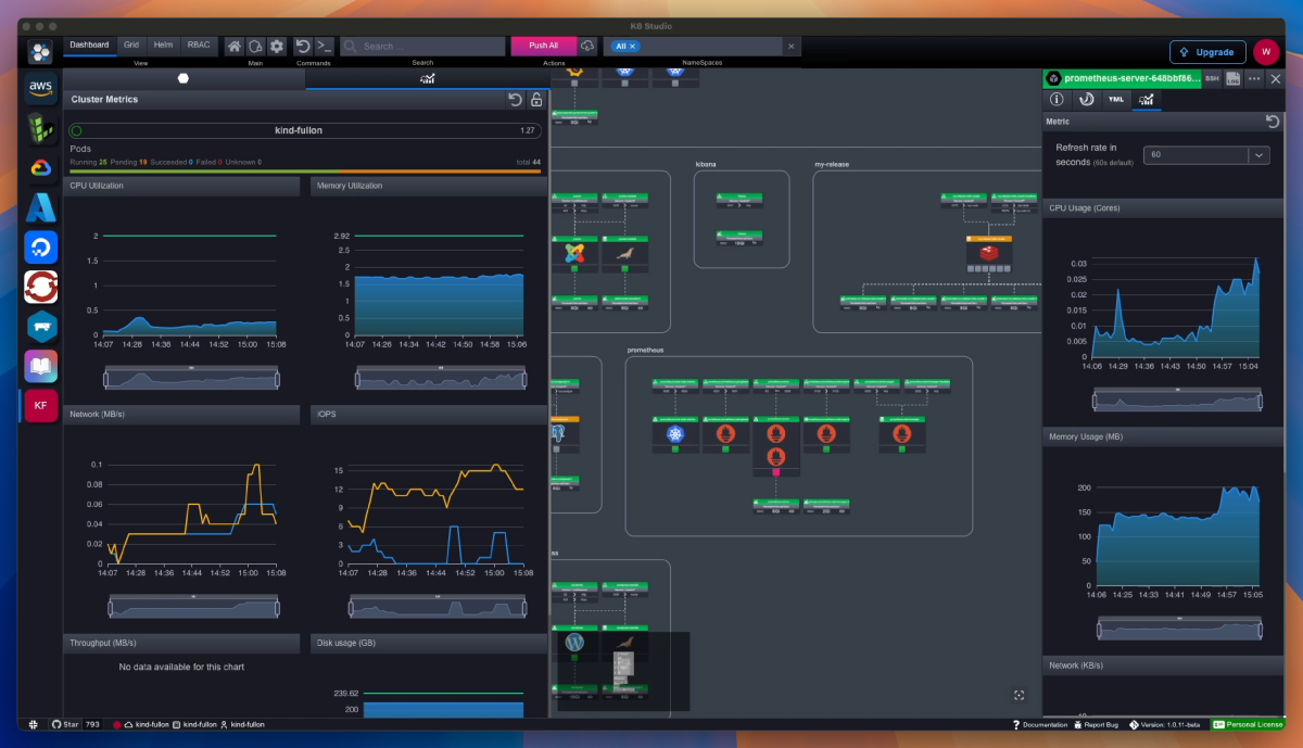

Monitoring Kubernetes today is a complex task. Even with carefully chosen tools, we often face an overwhelming array of dashboards brimming with countless charts, necessitating multiple monitors.
This information overload makes it challenging to pinpoint what truly matters. Critical information gets buried under a sea of metrics, hindering our ability to quickly understand what is going on and make appropriate decisions. As Kubernetes clusters grow, the complexity increases exponentially, making observability even more crucial. So, what do we do to keep track without losing our minds? Please don’t say another dashboard!!!
At K8Studio we think that the way to tackle this problem is through effective data visualization. We need a data visualization that provides a summarized view of our cluster’s status, giving us context and revealing relationships between events and objects within the cluster. It should also allow us to drill down into details when necessary. An intuitive visualization that quickly communicates high volumes of data directly to our brains is essential.
At K8Studio, we believe the way to tackle this problem is with state-of-the-art data visualization. This visualization needs to have the following properties:
Provide a holistic view of our cluster.
Describe the cluster structure and the relationships between the different parts.
Surface relevant information and minimize noise.
Enable us to easily navigate to different levels of detail and back, while maintaining the context of the navigation.
Excel in communicating high volumes of data intuitively and effortlessly.
You may wonder what this magical visualization is. And the answer, like all good things in life, is pretty simple and straightforward: MAPS!
Since ancient times, humans have used maps to represent complex worlds. Over time, we have adapted to consume maps efficiently, which is why most of us can understand a map without needing any explanation. Maps have the unique ability to show relationships and interactions between different objects, giving us the big picture while allowing us to drill down into details without losing focus. Combined with heatmaps, they enable us to surface the relevant information effectively.
At K8Studio, we have tried to adapt the concepts of maps to cloud computing, and more specifically to the management of Kubernetes Clusters. That is why we have introduced a new concept called CloudMaps in our latest release of K8Studio.
The primary function of CloudMaps is to represent your cluster as a map using color coding and heatmaps, providing a clear view of the status of different objects. It organizes objects by namespace and shows the network relationships between them, allowing you to understand who is connecting to whom. Additionally, CloudMaps features robust zoom capabilities with a minimap to enable detailed drill-downs when needed without losing focus of the whole. Cloud Maps combine the power of intuitive mapping with the precision needed for Kubernetes observability, helping us master the complexity of our clusters with ease.

his is how Cloud Maps look. When zoomed out, we can see the composition of our cluster and the workloads in different namespaces organized by application name. We can observe the number of pods and the status of both workloads and pods. The map also displays the relationships between objects, such as service-to-workload and workload-to-PVC connections. Workloads are marked with application icons to provide us with more information about the deployed images. All of this offers us a holistic view of the cluster. In this example, we can clearly see all the workloads with issues highlighted in yellow. Even someone unfamiliar with the cluster can grasp its composition and status within three seconds.
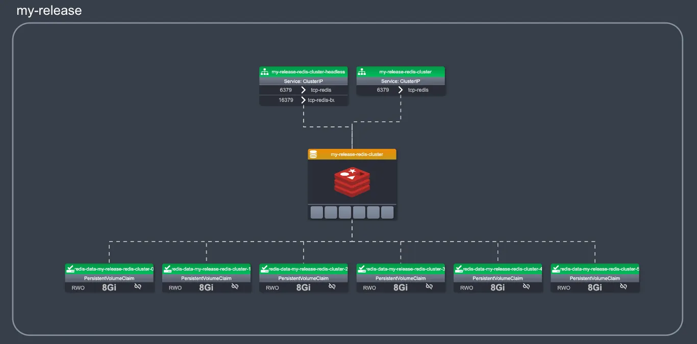
Once we have the big picture, we can zoom in on the map to see more detailed information about a specific part of the cluster that interests us. For instance, in this example, we can zoom in and see a Redis deployment with six unscheduled pods. We also see two services and their ports accessing the pods, and six PVCs, each bound at 8Gi. Just by zooming in, we gain more in-depth information, similar to how we would use a physical map to explore an area in greater detail. For example, at this zoom level, we can see the ports and target ports of the services, the size of the PVC, and their status.
To obtain more information about any object, we can simply click on the object to select it. A right-hand panel will appear, displaying additional details about the selected object.
In this panel, you can view even more detailed information. As the pictures below show, this panel includes different sections:
The Quick Editor: Showing the basic information and status.
YAML Editor: Providing access to the full YAML configuration.
The Timeline: Combining status and events ordered by time.
Metrics: Showing relevant metrics of the selected object, including CPU, memory with request and limit, network, and I/O operations.
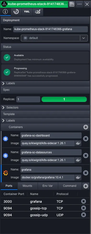
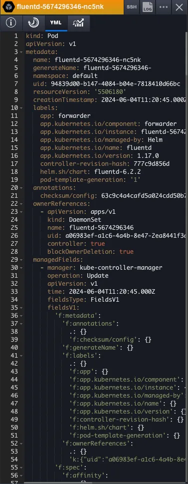
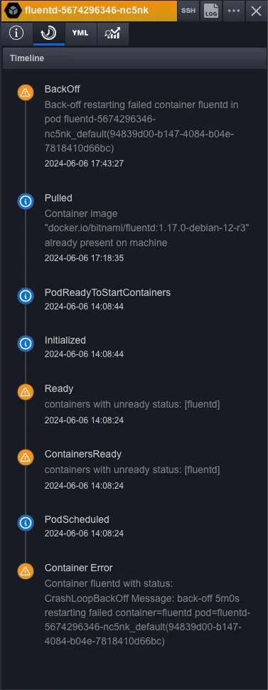
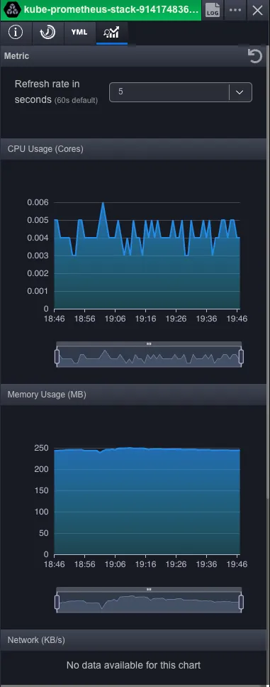
This panel enables us to gather extensive information, empowering us to detect issues and take the appropriate actions. Moreover, when the selected object is a pod, we can seamlessly establish an SSH connection or access the specific container logs via our integrated terminal.
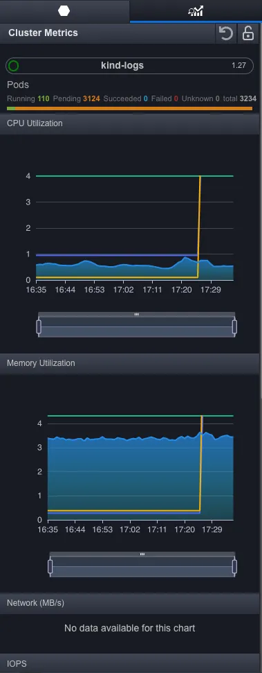
To conclude, we’ve incorporated nodes into the map, providing insight into their status, CPU, and memory utilization, along with details on the pods they host and the capacity for additional pods. An intriguing feature is that when selecting a pod, it will also be highlighted within the workload objects, facilitating a clear understanding of pod distribution and placement within the cluster. This comprehensive view enables seamless navigation and informed decision-making within the cluster environment.

The application can be downloaded at K8studio or on our GitHub Page
BTW If you like what we are building give us a star on GitHub.The team and I would be extremely grateful.